English
  日本語
日本語  العربية
  Deutsch
  Español
  Français
  한국어
한국어  Português
  Татар теле
  Русский
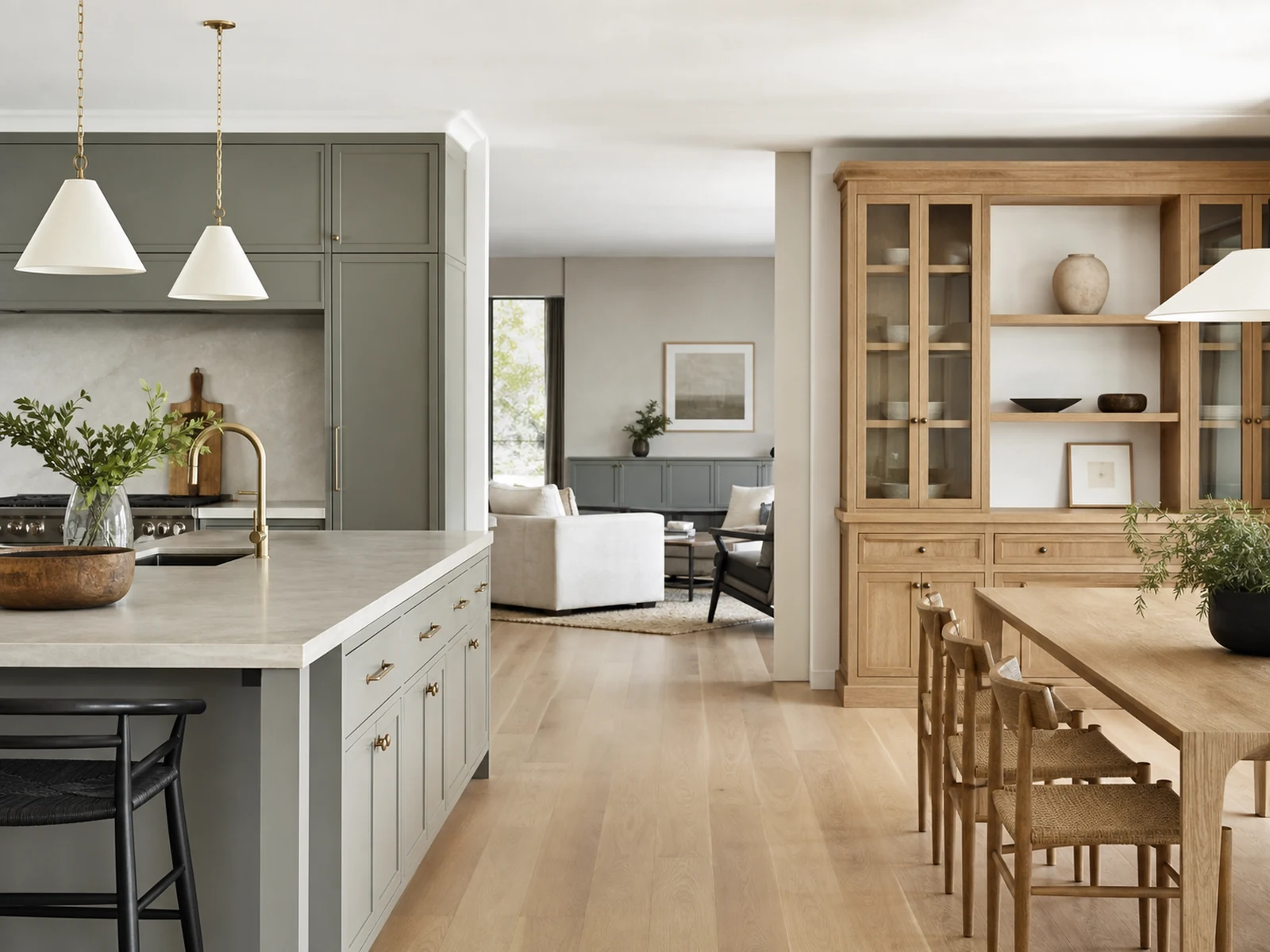
 When the kitchen, dining area, and living room share one view, cabinetry finishes for an open plan home cannot be chosen one cabinet at a time. A walnut sideboard, pale kitchen doors, a stone surface, a painted media wall, and metal handles may each look right on its own sample board. Seen together, they can still feel like separate design decisions unless one clear material hierarchy guides the whole space.
The goal is not to repeat the same finish everywhere. That can make an open-plan interior feel flat and showroom-like. A better approach is to decide which material leads, which materials support it, and which details should appear only as accents. Once that structure is clear, different cabinetry zones can have their own character while still belonging to the same home.
Cabinetry Finishes for an Open Plan Home Need a Hierarchy First
A material hierarchy is a simple order of importance. It answers three questions before anyone approves drawings or production samples:
- Which finish occupies the largest visual area?
- Which finish supports it without demanding attention?
- Which finish appears only in smaller moments?
In an open-plan home, the dominant finish usually appears on the largest cabinet surfaces or the most repeated planes. That may be a calm painted finish in the kitchen, a warm wood tone on selected dining storage, or a quiet neutral used across taller background cabinets. The supporting finish adds depth, while the accent finish provides contrast in a controlled way.
The mistake is treating wood grain, stone, solid color, and metal as five equal feature choices. If every surface tries to be the memorable one, the eye has nowhere to rest. The home starts to feel busy even if each finish is individually attractive.
Name the Dominant, Supporting, and Accent Materials
Before comparing samples, label each material by role:
- Dominant material: the finish that holds the biggest visual area.
- Supporting material: the finish that repeats enough to connect rooms.
- Accent material: the finish that appears in smaller surfaces or details.
For example, a pale painted kitchen might act as the dominant background. Walnut can become the supporting warmth across a sideboard, open shelf, or living cabinet detail. Stone can appear as a serving top, splash area, or horizontal surface. Metal may stay limited to handles, thin frames, or lighting channels.
Keep the Largest Surfaces Calmer Than the Feature Areas
Large cabinet surfaces have more visual power than small samples suggest. A finish that looks subtle as a hand sample can feel much stronger across full-height doors, a long island, or a living room storage wall. For this reason, the largest surfaces often need quieter colors, slower grain, or simpler panel rhythm.
Feature areas can carry more texture. A fluted walnut facade, a visible stone top, or a dark metal frame works better when the surrounding planes are edited enough to let it read clearly.
Give Wood, Solid Color, Stone, and Metal Separate Jobs
The clearest open-plan interiors usually do not use fewer materials. They use materials with clearer jobs.
Wood grain can bring warmth and movement. Solid color can calm large areas. Stone can add weight and a practical surface. Metal can define edges, pulls, frames, or shadow lines. When those roles are mixed without a plan, the palette loses discipline.
Use Wood for Warmth and Rhythm
Wood is often the material people notice first, especially in walnut, oak, or darker veneer tones. It has grain direction, natural variation, and a visual rhythm that changes across doors and panels. In an open-plan home, wood should be placed where warmth is needed, not everywhere a blank cabinet appears.
If the kitchen already has strong wood grain, the dining sideboard may repeat the same tone in a lower, quieter format. If the kitchen is mostly painted, wood can appear as a dining storage feature or a living room shelf detail. The important point is to decide whether wood is the main finish or the connecting thread.
Let Solid Colors Create Visual Rest
Solid cabinet colors are useful because they can make the open-plan view easier to read. Warm white, muted taupe, greige, charcoal, or soft green can hold large surfaces without adding the movement of grain. They are especially helpful on tall cabinets, background storage walls, or upper cabinetry.
This does not mean every solid color must be plain. The finish can have a matte, satin, or lightly textured surface. But its job should stay clear: it gives the eye rest between more active materials.
Use Stone and Metal as Controlled Accents
Stone and metal carry weight. A pale stone top on a sideboard, a veined kitchen worktop, bronze handles, or black metal shelf frames can sharpen the palette. Used too often, they can make every zone feel like a separate feature wall.
Stone should be reviewed by surface size and location. A stone kitchen island, a sideboard top, and a TV wall panel may all be visible at once. They do not have to match exactly, but their undertones should not fight each other. Metal finishes should also be edited. Mixing black, brushed brass, chrome, and warm bronze in one view requires a very careful hand.
Repeat Details Instead of Copying Whole Cabinet Compositions
Connected does not mean identical. One of the most useful ways to coordinate visible cabinetry is to repeat details while allowing each cabinet zone to change scale, function, or height.
For example, the kitchen may use flat painted doors with a walnut open shelf. The dining sideboard may use fluted walnut doors with a stone top. The living room storage may return to painted doors but repeat the same handle finish or shadow gap. The repeated detail tells the eye these pieces were planned together.
Grain Direction and Panel Rhythm
Grain direction matters more than many buyers expect. Vertical grain can make doors feel taller and more architectural. Horizontal grain can make a low sideboard feel longer and calmer. Fluted panels add rhythm because the surface creates repeated shadow lines.
Designer Note: If two wood finishes will be visible from the same seating position, do not approve them only from small samples. Review the grain direction, panel width, and door rhythm together. Two similar walnut tones can still clash if one has a busy cathedral grain and the other has a straight, quiet grain.
Hardware, Shadow Gaps, and Metal Finish Temperature
Handles and metal details can connect cabinetry without forcing the same door finish everywhere. A consistent black pull, brushed bronze handle, or slim shadow gap can help the kitchen, dining storage, and living cabinetry feel related.
Keep the metal temperature consistent unless there is a strong reason to contrast. Warm brass and cool chrome can work together in some interiors, but they need separation by zone and careful lighting review. In many custom cabinetry projects, a smaller set of metal finishes gives the final space more control.
Let the Sideboard Carry the Transition from Kitchen to Living
The dining area often sits between the kitchen and living room, so the sideboard is a useful transition piece. It does not need to copy the kitchen cabinets. In fact, copying the kitchen too closely can make the dining zone feel like an extension of the work area rather than a softer in-between space.
A better sideboard can carry one kitchen material forward, change the cabinet height, and adjust the visual weight. This is where a fluted walnut sideboard with a stone top can help bridge the palette: the walnut brings warmth and vertical rhythm, while the stone top can relate to kitchen worktops or serving surfaces without repeating the full kitchen composition.
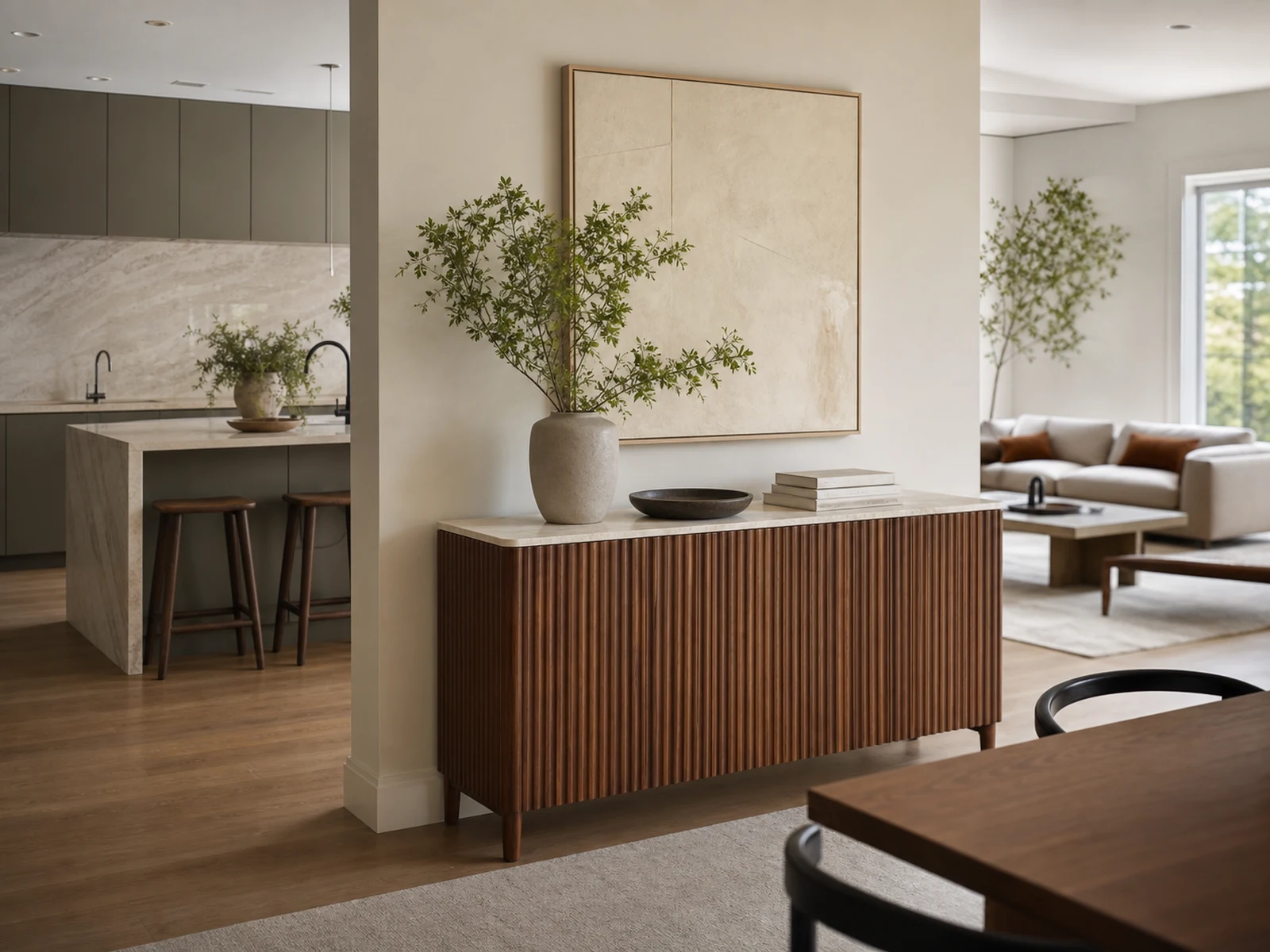
Carry One Kitchen Material into the Dining Zone
Choose one material connection rather than copying everything. If the kitchen uses pale stone, the sideboard top can echo that stone family. If the kitchen has walnut shelves or an island accent, the sideboard facade can carry walnut into the dining zone. If the kitchen is painted, the dining storage might repeat the hardware finish instead.
The sideboard should answer the kitchen without becoming another kitchen cabinet.
Change Cabinet Height and Visual Weight
Lower cabinetry reads differently from full-height storage. A low sideboard can accept a richer finish because it sits below the main sightline and leaves wall space above. This is why fluted walnut can feel controlled on a sideboard even when it would feel heavy across a large wall of tall cabinets.
Designer Note: In an open-plan room, height is part of the finish decision. The same material can feel calm on a low cabinet and overwhelming on a full-height wall.
Control Contrast by Distance and Sightline
A finish does not have the same effect from every distance. A textured walnut facade, veined stone, or dark metal frame may be attractive up close. Across a long open-plan sightline, the same contrast can become stronger than expected.
Before final approval, look at the room from the main entrance, sofa, dining chair, kitchen island, and hallway approach. The most visible background surfaces should usually be calmer than the foreground pieces.
Foreground Cabinetry Can Carry More Texture
Foreground pieces are closer to the body and hand. A sideboard, island front, bar cabinet, or display cabinet can carry more texture because the viewer experiences it as a chosen feature. Fluting, visible grain, and stone edges often work well here.
Background Cabinetry Usually Needs Quieter Finishes
Background cabinetry is different. Tall kitchen units, full-wall living storage, or long runs of upper cabinets often need quieter finishes because they sit in the view for longer. If these surfaces are too active, the room may feel restless.
Designer Note: When two feature finishes are visible in one direction, reduce contrast somewhere else. A strong walnut sideboard may ask for simpler living cabinetry. A dramatic stone island may ask for quieter dining storage.
Test Samples in Daylight, Evening Light, and Adjacent Rooms
Screens, hand samples, and completed cabinetry never behave exactly the same. Natural wood has variation. Stone can change from slab to slab. Painted and laminated finishes can look cooler or warmer under different light. That is why sample approval should happen under more than one condition.
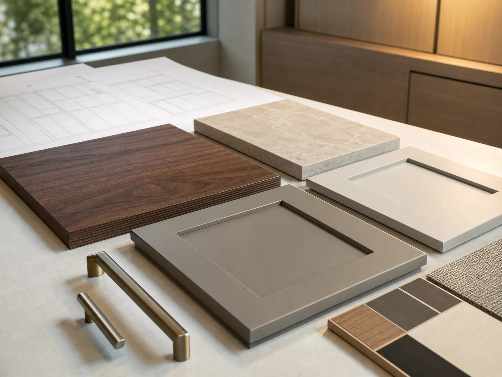
Material Comparison Before Approval
| Material or check | What can change | What to review before production |
|---|---|---|
| Wood veneer or wood-look finish | Grain direction, tone variation, panel matching | View several samples together and confirm grain direction on drawings. |
| Painted or solid color panels | Warm or cool undertone under different light | Place beside flooring, wall paint, stone, and metal hardware. |
| Stone top or stone-look surface | Veining, edge visibility, color cast | Review slab or larger sample when available, not only a small chip. |
| Metal handles or frames | Warmth, reflectivity, fingerprint visibility | Compare with lighting color, appliances, and nearby furniture hardware. |
| Fluted or textured panels | Shadow depth and cleaning access | Check profile depth, finish continuity, and how dust can be removed. |
Do Not Promise Exact Matching
Even with careful sampling, exact matching between screen images, hand samples, and completed cabinetry should not be promised. The safer goal is controlled coordination. Samples should be close enough to support the palette, and natural variation should be expected where real wood or stone is involved.
Finish Combinations That Need Careful Editing
Some combinations can work well, but they need editing before they are approved:
- Two strong wood grains in the same open view, especially if the grain direction and color temperature differ.
- A dramatic stone island plus a dramatic stone sideboard top plus a stone TV wall.
- Warm brass, black metal, chrome, and stainless steel all visible in one sightline.
- High-contrast kitchen cabinetry next to high-contrast living storage.
- Fluted panels used on too many cabinet zones without a quieter surrounding surface.
- A dark sideboard placed against dark flooring and dark wall panels without enough visual separation.
The issue is not that any of these materials are wrong. The issue is that each one has visual weight. The more weight one finish carries, the quieter the neighboring finish may need to become.
A Short Approval Checklist Before Production
Before approving cabinetry finishes, review the palette as a system:
- Identify the dominant material across the open-plan view.
- Confirm which finish connects the kitchen, dining, and living zones.
- Check wood grain direction on elevations, not only on loose samples.
- Compare solid color panels beside flooring, wall color, and stone.
- Review stone undertones and edge profiles.
- Limit metal finishes or give each one a clear zone.
- Check sideboard height, wall position, socket locations, and skirting coordination.
- View samples in daylight and warm evening light.
- Confirm which finishes have natural variation.
- Keep final approved samples and drawings together before production.
This checklist is simple, but it prevents one of the most common open-plan problems: approving each cabinet finish separately, then discovering that the whole room feels less connected than expected.
Frequently Asked Questions
How many cabinet finishes can an open-plan home use?
Most open-plan homes can use several finishes if each one has a clear role. A practical palette might include one dominant cabinet finish, one supporting wood or color, one stone surface, and one metal finish. The number matters less than the hierarchy and sightline control.
Should the sideboard match the kitchen cabinets?
Not always. A sideboard can repeat one kitchen material, such as stone, walnut, or hardware, without copying the full kitchen design. This helps the dining area feel connected but still softer than the cooking zone.
Can online images be used for final finish approval?
Online images are useful for direction, but they should not be treated as final approval. Screen color, photography, and lighting can all change how a finish appears. Physical samples and larger panels, when available, should be reviewed before production.
Keep the Palette Connected, Not Identical
Cabinetry finishes for an open plan home work best when they are connected by hierarchy, not forced into sameness. One material can lead, another can soften the transition, and smaller details can repeat across rooms.
For a custom cabinetry project, the most useful next step is to prepare the floor plan, main sightlines, finish references, and physical sample requirements before final drawings are approved. Sunrise Furnishing can review cabinetry zones, material roles, and production details with overseas homeowners, designers, and project teams who need open-plan storage to feel coordinated across more than one room.